
Performance
Some of these products had been in use for nearly 20 years, bugs were increasing, the code was fragile, we often broke production with new releases, and developers were afraid to touch some areas.

Re-architecting 7 legacy products into a unified platform through an IA-first phased migration
Executive summary
ArbiterSports had built 7 products over nearly 30 years, each with its own brand and navigation, and a single customer often bounced between several of them in a day. For the first time in company history, state associations that had been customers for decades were looking at competitors, and nearly half of all support traffic traced back to eligibility & registration. I was hired to redesign the screens. Within a few weeks it was clear the information architecture was the real problem.
I designed a phased migration that fixed the IA before the UI: standardized navigation across all 7 products, tested a user-based architecture with a card sort sent to 1,000 users, then rebuilt eligibility & registration as the pilot with my product partner and a cross-functional team. The launch was the most successful in company history, retained 1,200+ schools across 11 states, and directly enabled the 2nd biggest deal the company had ever signed.
Project role
Lead UX Designer & Researcher
Time frame
2019 - 2020
Company size
65
Leadership Scope
2
Company stage
Startup
Industry
Athletic & Activity Management (SaaS)
50X
Reduction in Eligibility Setup
25X
Reduction in Registration Setup
1,200+
Schools Retained
#2
Biggest Deal in Company History
Problem & Stakes
ArbiterSports builds sports management software that helps the NCAA, high school state associations, and other governing bodies find, schedule, register, and pay referees. Over nearly 30 years the company had built 7 products for different personas: governing body admins, assigners, officials, athletic directors, finance. Each had its own brand, its own navigation, and in some cases its own domain.
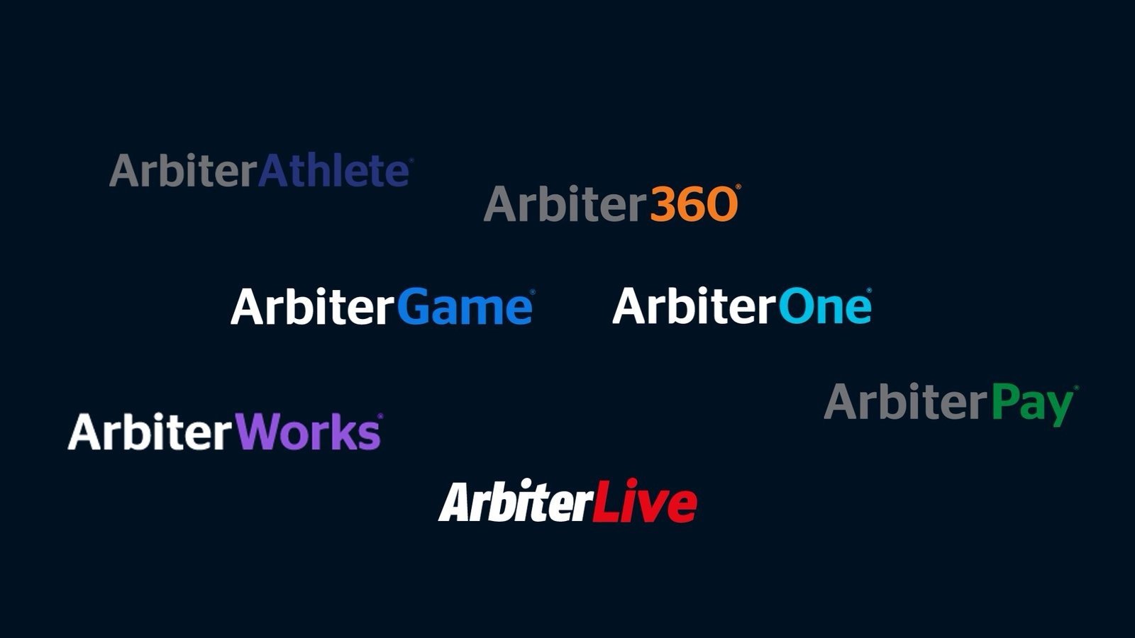
The products were meant to be complementary by persona. In practice one person often performed the role of several personas and was constantly switching from one product to another to get their work done. A "context switcher" had been bolted on to move between them, but you had to know which role would take you to which product, and each selection completely changed the UI. Navigation followed a different mental model in every product. The outdated technology underneath also blocked the simple usability improvements users have come to expect from modern software.
Referees were central to the entire suite. Assigner companies paid us to help them schedule and pay officials, governing bodies paid us to help them register and qualify officials, and the transaction fees from those payments made up a large chunk of our revenue. There was also a major referee shortage in high school sports, and it was the #1 focus of most of our clients. Anything that made it harder for a referee to register, or for an admin to set up the season, hit the business directly.
The business had 3 problems it could no longer ignore:
Eligibility & registration sat at the center of all of it. It was by far the worst user experience in the suite, the most volatile area of the code, and the pain point customers named most often when they talked about leaving. In fact, fielding referee registration questions made up 38% of total support volume.
The executive team and board had invested in a UX team (hiring me) because they understood that being customer-centric had to show up in the product, not just in how we sold and supported it. We set 4 goals:
The initial thought was to just "redesign" and build each page in a modern technology stack. As I started diving in and becoming more familiar with our products, it quickly became apparent to me that a more foundational change was needed.
Strategic Approach
The redesign I was hired for wouldn't hold unless the structure underneath it changed first.
The initial thought when I was hired was to redesign each page in a modern technology stack. What I proposed instead was to fix the information architecture first and let the UI follow it. Every problem customers were naming, the context switcher, the different navigation in every product, the settings scattered everywhere, lived in the structure, and a modern coat of paint would have left all of it in place.
The strategy came down to 3 things:
"His first objective when he arrived was to get to know customers, to talk to them, to ask questions, and to be a good listener. And he turned that understanding into truly great designs that jumped our product forward 20 years!"

Execution & Alignment
With the IA set, we chose the section that hurt the most and touched the least, and used it to work out how the whole migration would run.
Working with the executive team, product management, sales, and other stakeholders, we chose eligibility & registration as the first chunk of functionality to migrate. It was:
When we started looking in the data, we found some interesting things:
100
eligibilities per client per season
163
registrations per client per season
181 hrs
of admin setup per client per season
148
clients relying on custom fields
From our research, we learned:
Eligibility requirements didn't change from sport to sport, and very little changed on registrations from year to year, yet admins were rebuilding all of it every season, one sport and fee structure at a time.
148 clients were using custom fields, an average of 8 each, and every unusual fee case was being handled with a custom script written by an engineer.
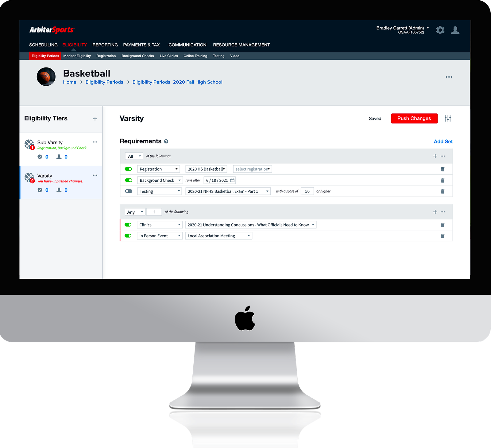
The redesign didn't need to make 100 eligibilities faster to create. It needed to make 1 or 2 do the job of 100.
Outcomes & Downstream Impact
The most successful product launch in company history, and the first time UX had a seat in how the company built software.
50X
Reduction in Eligibility Setup
25X
Reduction in Registration Setup
1,200+
Schools Retained
#2
Biggest Deal in Company History
One of the biggest pain points in the old system was having to create separate eligibility requirements and registrations for every level and fee structure per sport. That often meant upwards of 100 per year, each configured and updated separately. We reduced that to 1 or 2, and admin work to configure eligibility & registration went from weeks to minutes. Fee rules eliminated 96% of the custom scripts engineers had been writing, and registrations went up 27%.
We took a pilot release approach, rolling out to a limited number of customers at a time, and knew that not everyone would be able to move at first. Instead, we were overwhelmed by how many customers simplified their own internal processes, their registration pricing structure for example, so they could join sooner. One client who had been very skeptical when we first asked them to join our user research not only wanted onto the new system after seeing it, but simplified many of their processes and fees to be part of the initial pilot group.
What it did for retention and revenue:
I refused to let anyone else use registration in the past because of the sharp learning curve. This new system I could train everyone on in a heartbeat.
This was the first time a cross-functional, user-driven design process had been used at the company. Before this project developers and product managers rarely collaborated except to estimate user stories, and design had never really been a fundamental part of the process. During the project, developers got excited about observing user research. A cross-functional team room became the norm. Engineering started bringing me into discussions that had previously been purely engineering, like database architecture and pipeline flow. And for the first time, more UX resources were requested by someone other than UX.
We still had a long way to go in both the product and the culture, but this project changed the course of the UX maturity of the company. It was no longer a conversation of "if" we should invest in UX, but "how many" and "when".
Before
7 products with 7 navigations. Admins rebuilding ~100 eligibilities and ~163 registrations every season. Fee edge cases handled by engineer-written scripts. Design outside the room; PMs and developers meeting to estimate stories.
After
1 navigation across every product, and the first section fully migrated behind it. 1-2 eligibilities per season, set up in minutes. Fee rules admins configure themselves. Design in the database discussions, engineers in the usability tests, and UX headcount requested by other departments.
Reflections
What made a difference
What I'd do differently